Brooks Brothers
During the Summer of 2013, I worked with America’s oldest clothing retailer to provide a solution for the branding of their archival images posted to social media.
Every Friday they would post an image from their rich archives of 19th/20th century Brooks Brothers advertisements. These being their most popular postings, they were often re-shared through platforms like Pinterest and Tumblr, losing the description of the image along the way. Slapping their logo on the the image was not enough. There needed to be consistent branding for each Archive image they were sharing.
Process
I first sketched multiple rough directions, using the vintage typography from their old advertisements as inspiration. I took into consideration the placement of the type lockup, as it would sit in the frame.
A few initial rough ink sketches, experimenting with different type and ornamentation styles
Running with the most successful concept, I refined each letter to give the type a sense of structure. Adding a drop shadow and simplifying the "From Our" helped to ground the design nicely.
Tight sketch of the lettering, with ornamentation.
(gif of archive friday images, border not changing)
Miscellany Lettering
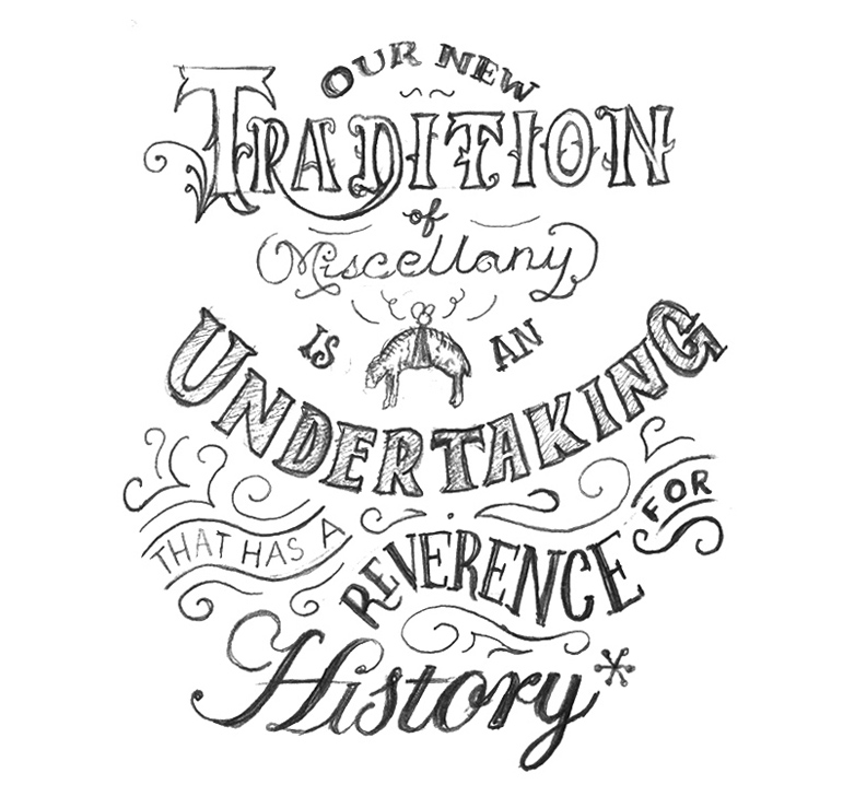
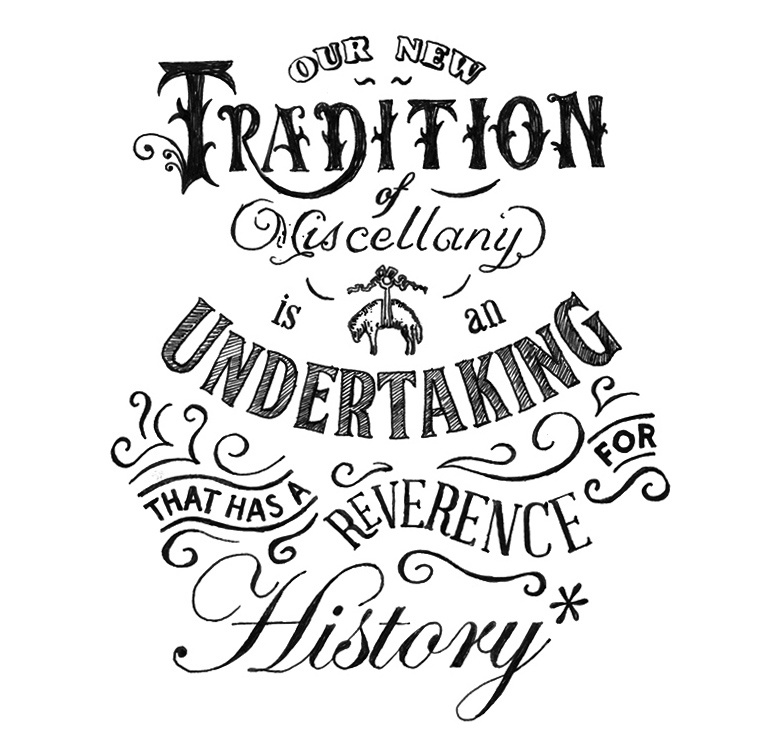
Right around the same time, Brooks Brothers was reintroducing an old tradition of theirs. Miscellany was a monthly publication put out by the company that contained information about their product and other sartorial content. Miscellany was discontinued in the 60’s, but was about to be brought back in the form of an online magazine. To announce this new opening, I was commissioned to create this custom lettering print.
Rough Pencil Sketch
Refined Ink Drawing


