What's The Opposite of Lettering?
Recently I was having a conversation with a friend of mine recently about design thinking and he brought up this concept of "flipping it". I had never heard of this before but I found it to be a really helpful with a project this week.
"Flipping it" is a technique that designers can use when they get stuck in the ideation phase. It's really simple...
Do the exact opposite of what isn't working.
What's the opposite of walking? Is it running? Sitting? Walking on your hands? Hovering?
There's not one clear answer. But you see what just happened there? As soon as I started thinking about the opposite of walking, I came up with 4 ideas super easily. Kind of a strange example, but you can see how this constraint helped the creative process. I believe this is much easier and more fun compared to the struggle of pushing through a creative block, and trying to come up with a new idea out of thin air.
If you are struggling with a drawing, do the opposite. Can't make come up with a unique logo? Just do the opposite. If you can't write, sing, act or dance, just do the opposite! Odds are you will come up with an execution that leads you closer to what you were aiming for.
How I "Flipped It" This Week
This week I was working on a letter F for my Typefight submission. I knew I wanted to try something a little different for this design, but I wasn't quite sure what to do.
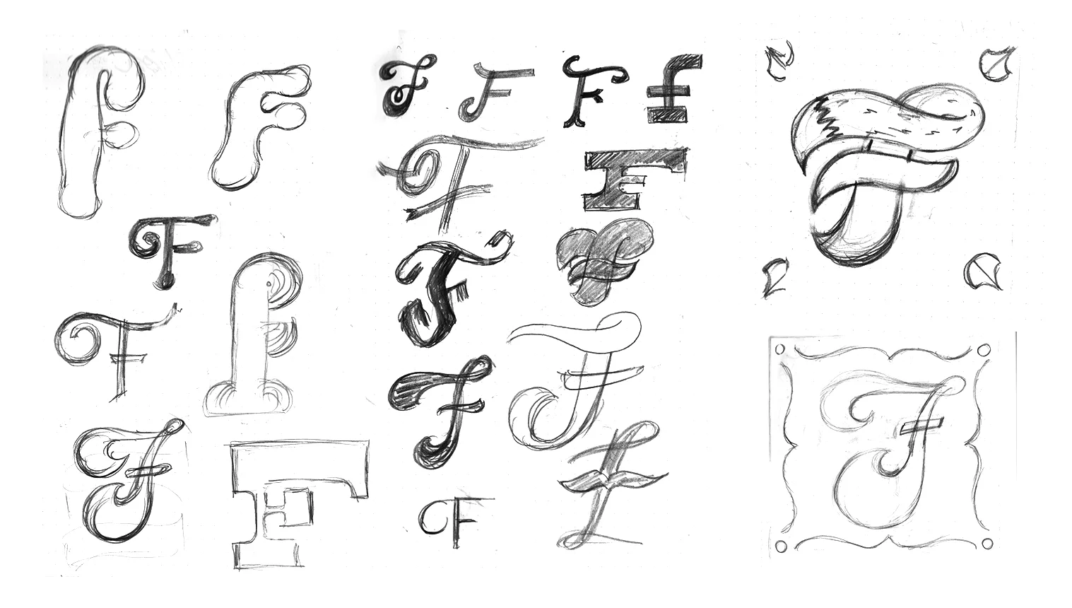
Like always, I started with a bunch of really rough sketchy ideas. Then I tried some larger, more thought out sketches in the square format. I wasn't feeling any of these this predictable directions, and I couldn't think of anything better. I was hitting a wall.
The next day, I came back and looked at my messy sketches, and tried to Flip It.
What's the opposite of a letter F?
Backwards F? An upside down F? Well, it still needs to look like a nice letter F to work for the project. Hmmm...
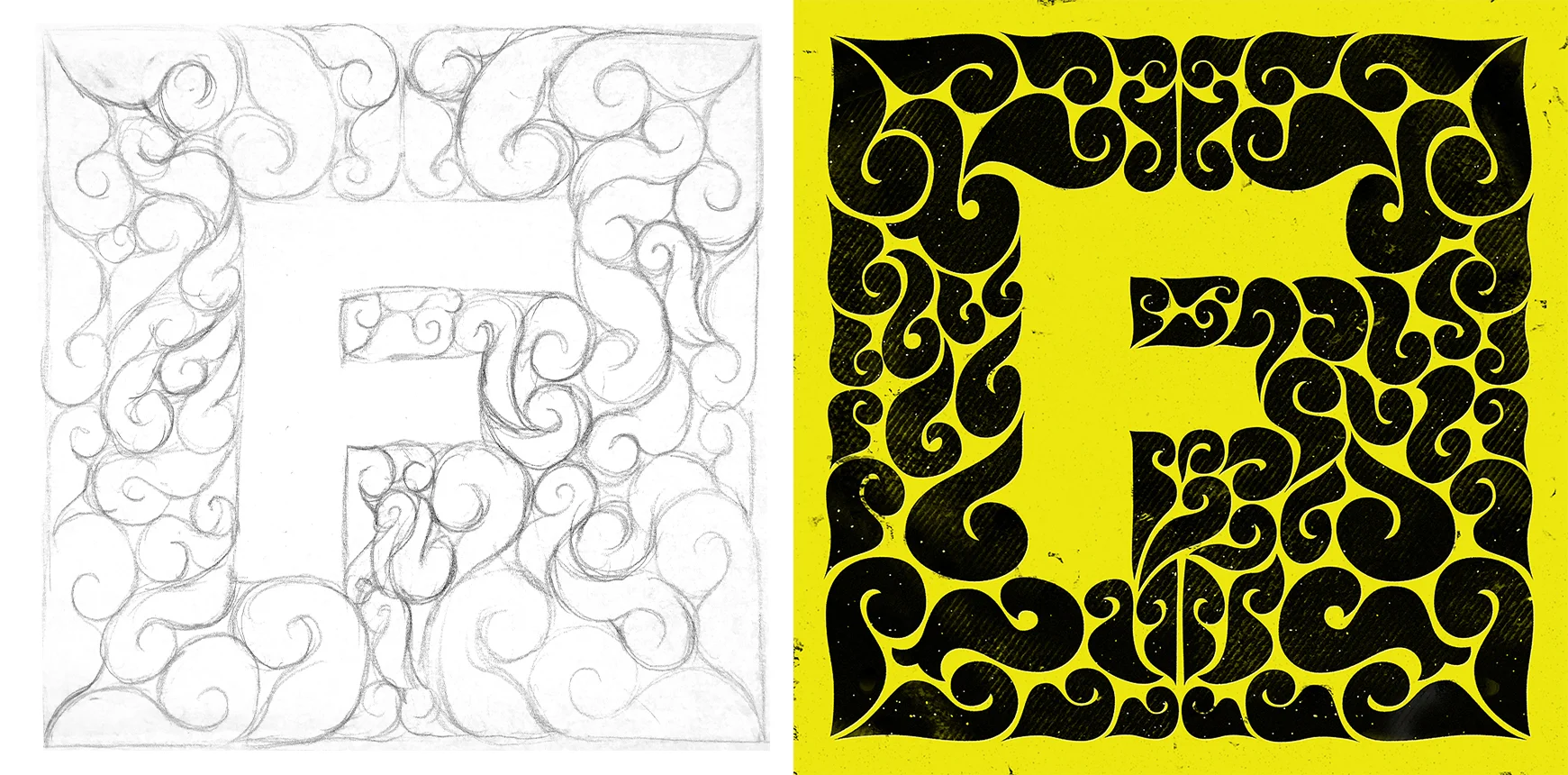
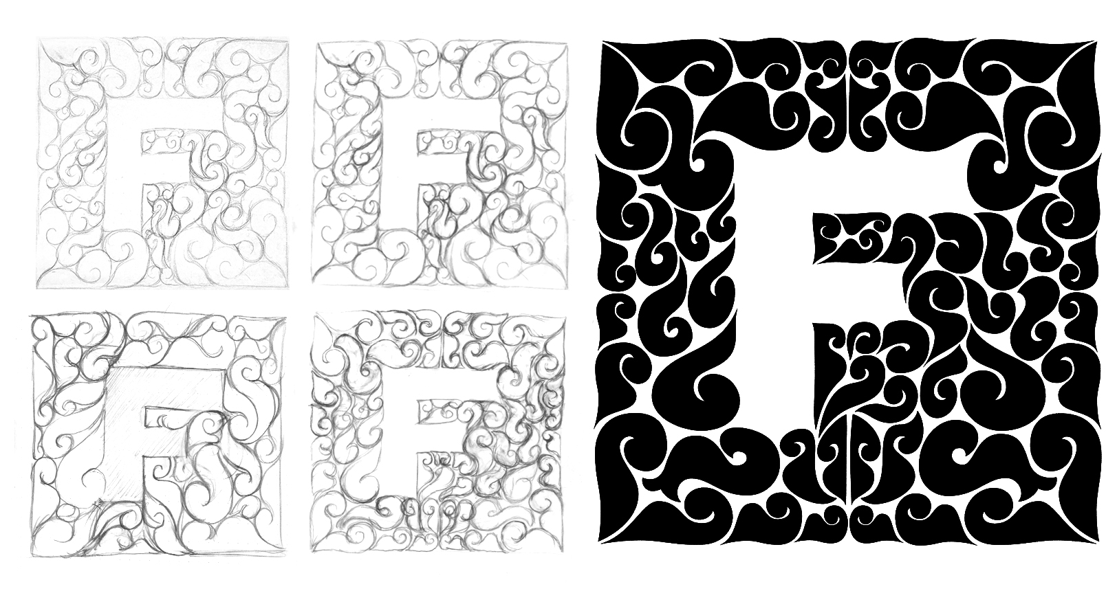
Aha! What if, instead of making an ornate letterform, I made a super illustrative background, and cut a really simple letter out of the negative space!
After some trial and error, I ended up with a concept that felt fresh but still in line with my tastes. Here's the final design!
Here's the bottom line:


