Adobe - Make It On Mobile Workshop 2017
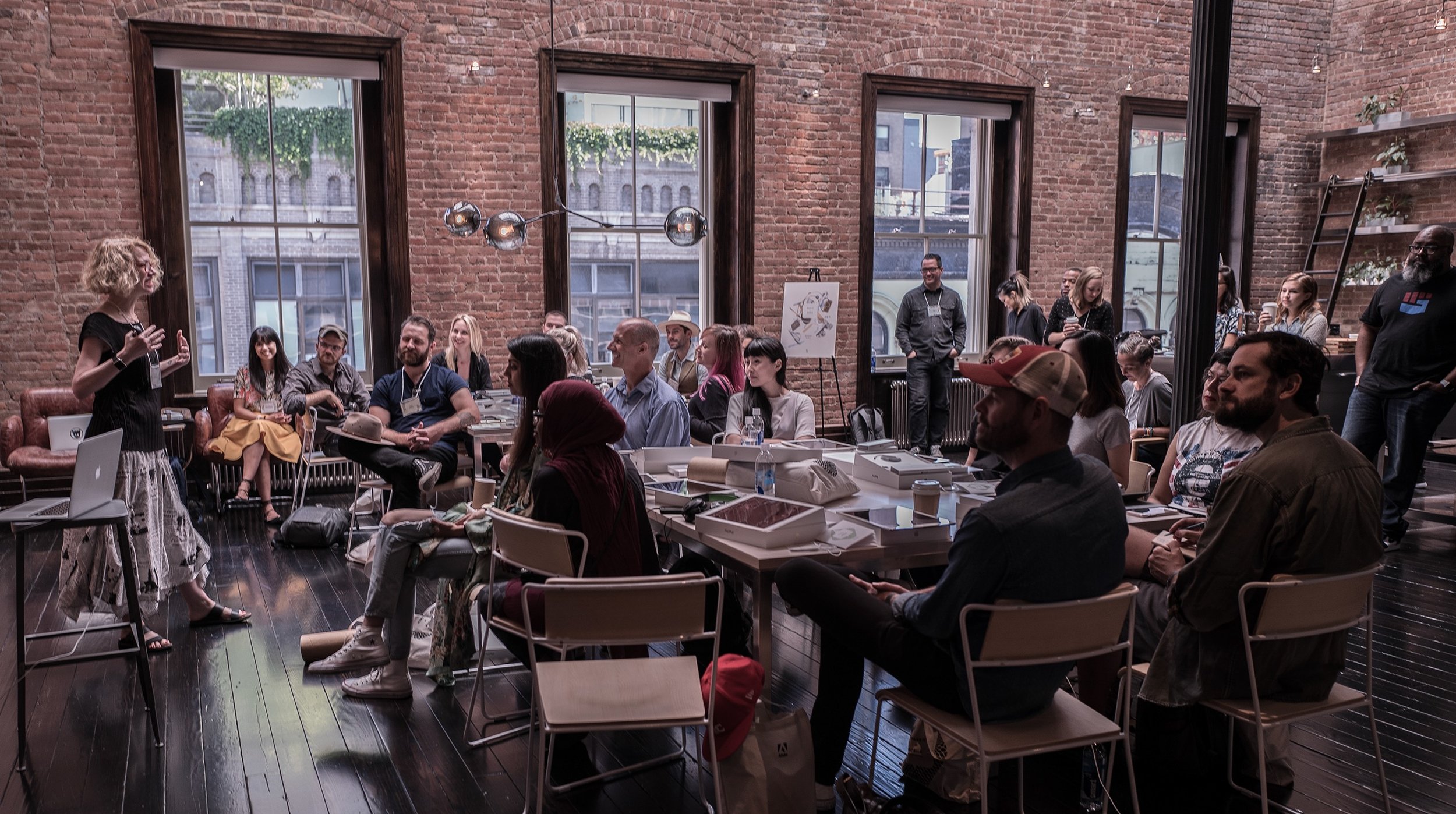
Last week I spent 2 days collaborating with the mobile design team from Adobe along with 23 other artists from around the world.
We were invited to a private event called Make It On Mobile devoted to testing out the newest beta versions of iPad apps for drawing, design and photo editing.
Disclaimer: I wasn't paid to write this or to attend the event. Just sharing my honest experience here.
First off, huge thanks to everyone involved (you rock!). It felt surreal getting invited to something like this... I've been working a lot with Photoshop and Illustrator on my Mac for over 10 years so I'm obviously a big fan of both Adobe and Apple.
The other artists were so impressive and diverse - photographers, illustrators, designers, letterers - some coming all the way from places like Tokyo and Sweden, ranging in age from 21-55. Let alone getting to participate, just to witness it all go down was beyond inspiring.
Ellen Lupton is probably the biggest lover of design I have ever met.
In the beginning we were divided into pairs and each asked to pick a quote from a table of printed cards.
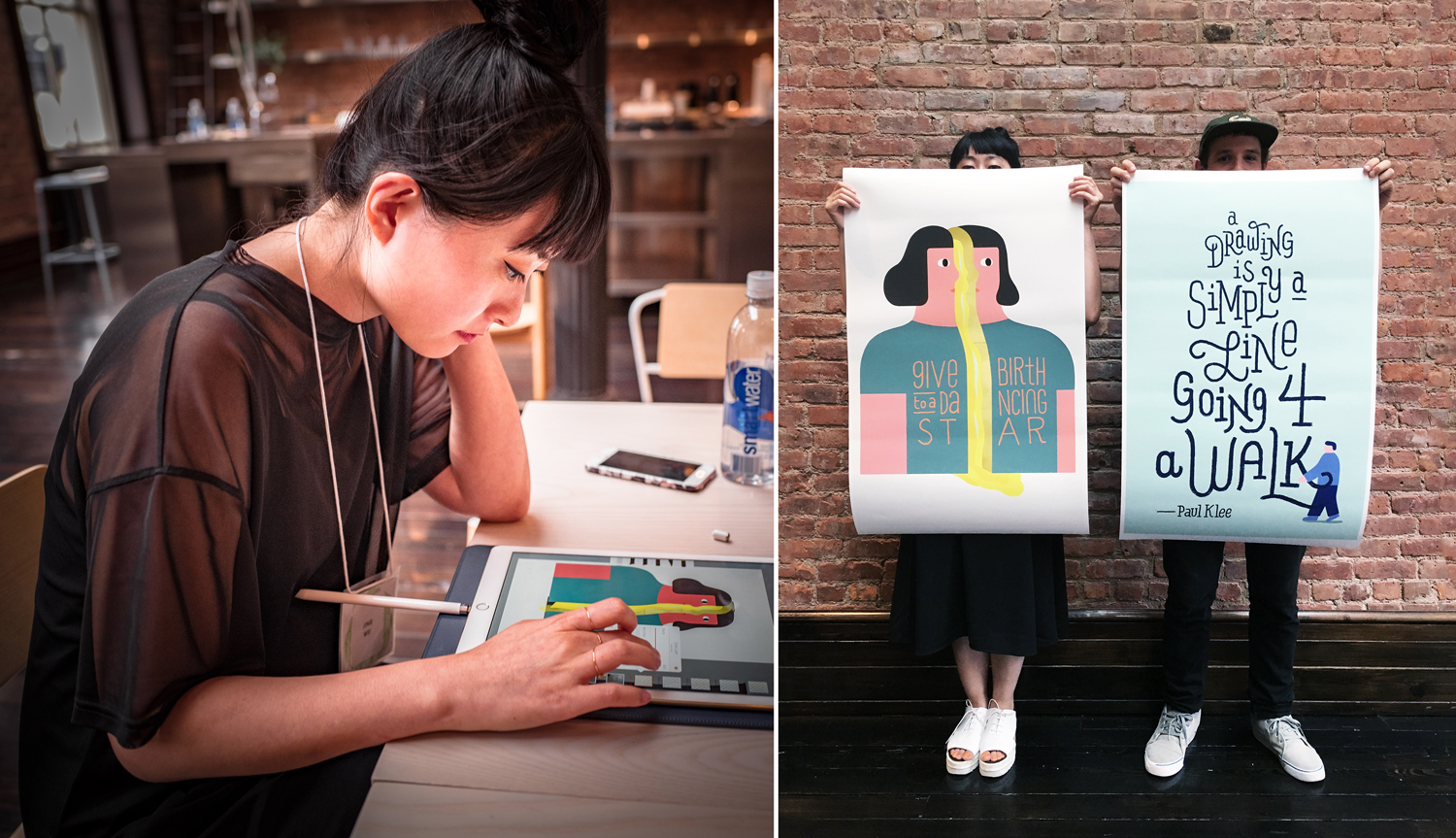
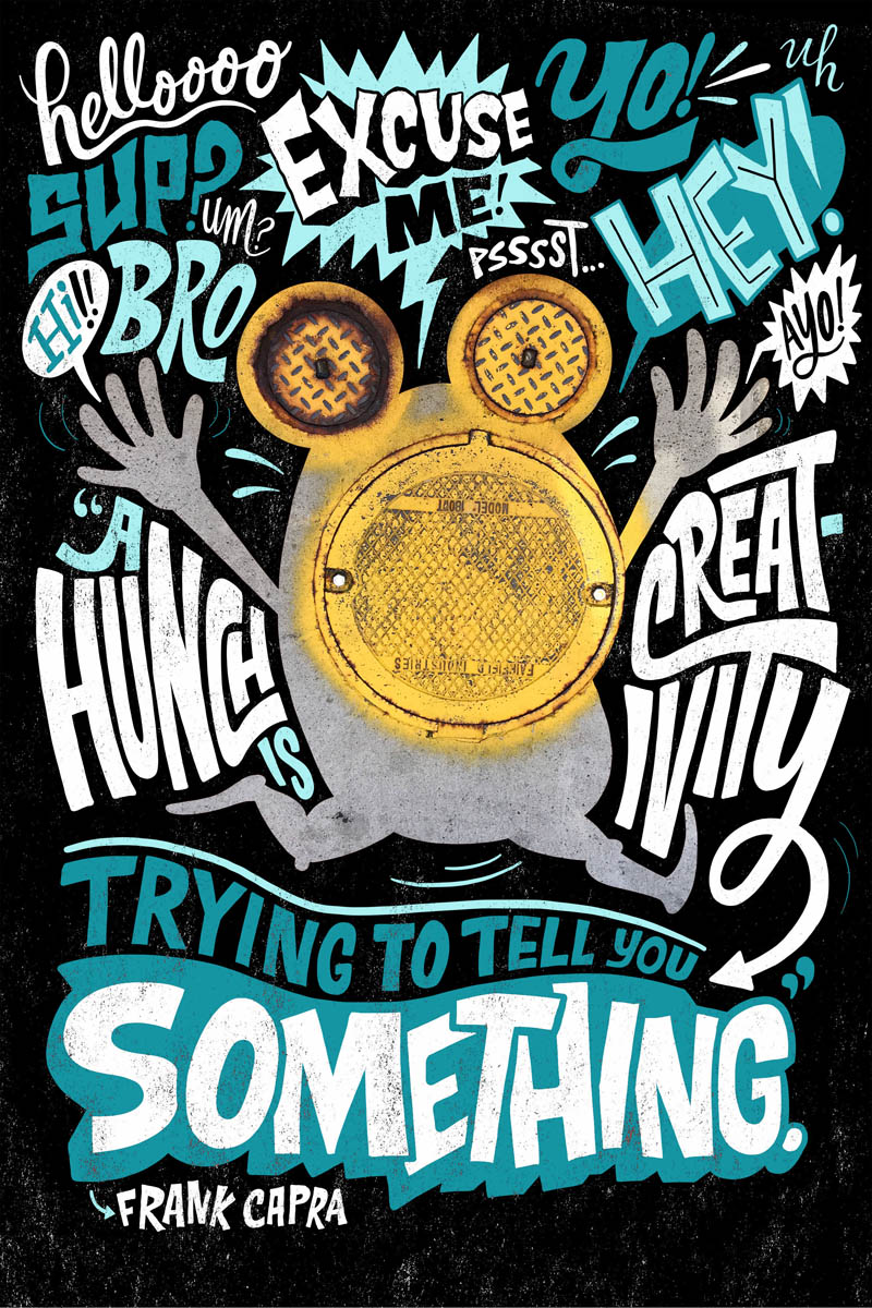
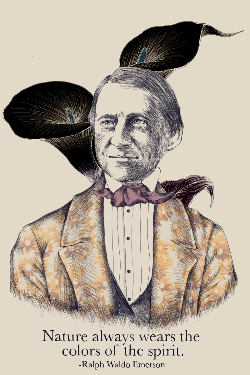
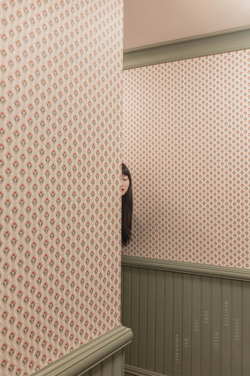
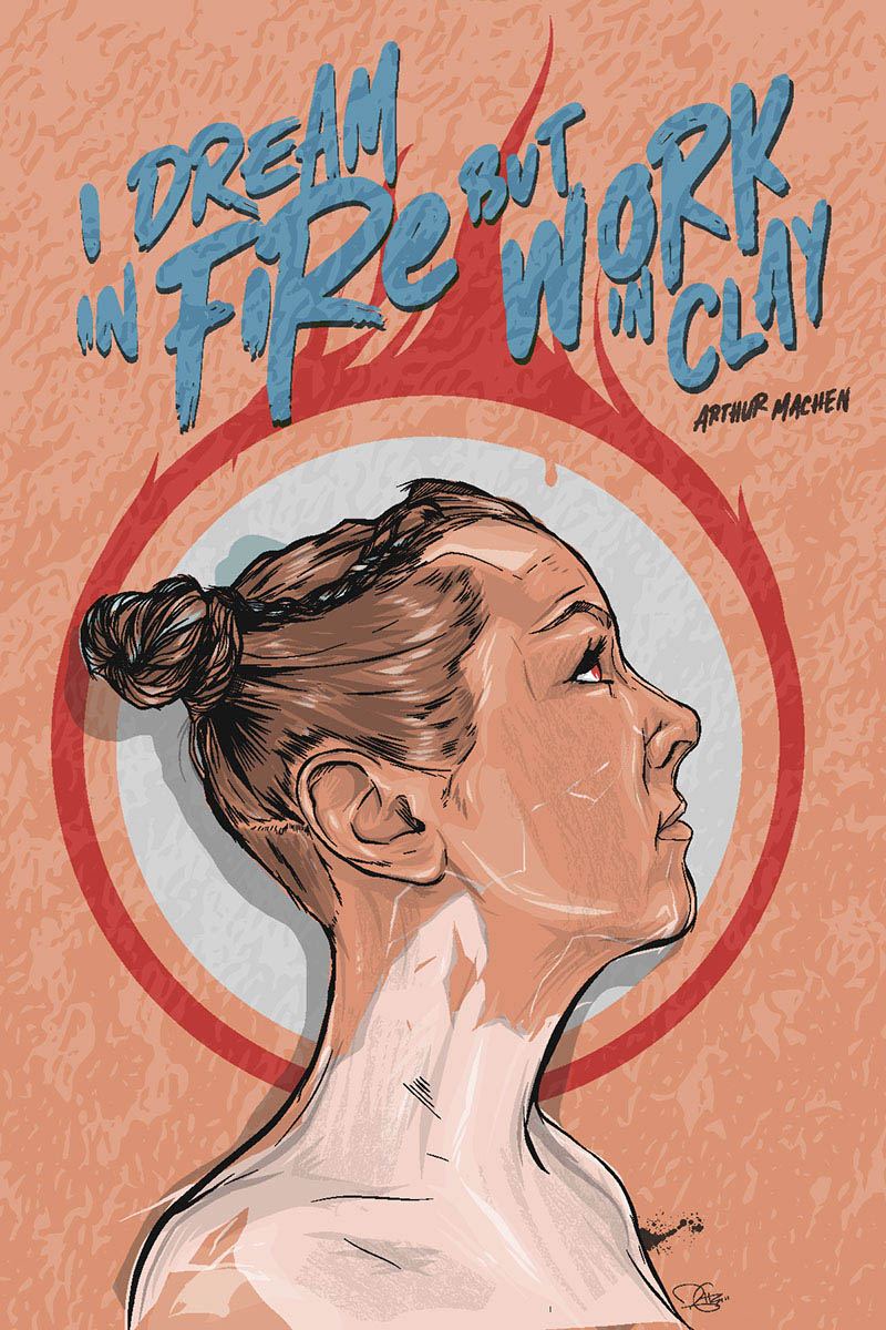
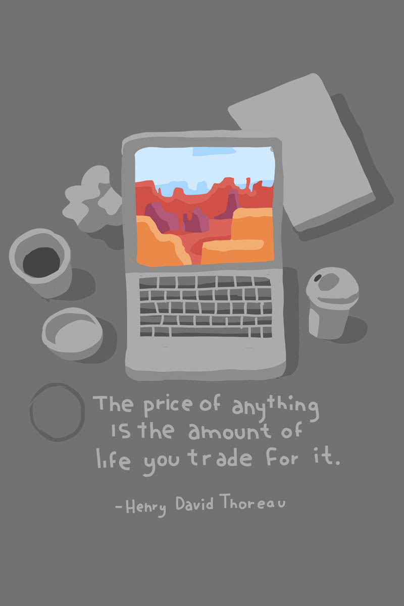
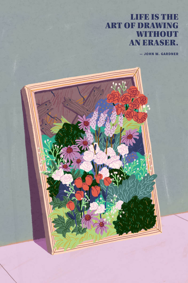
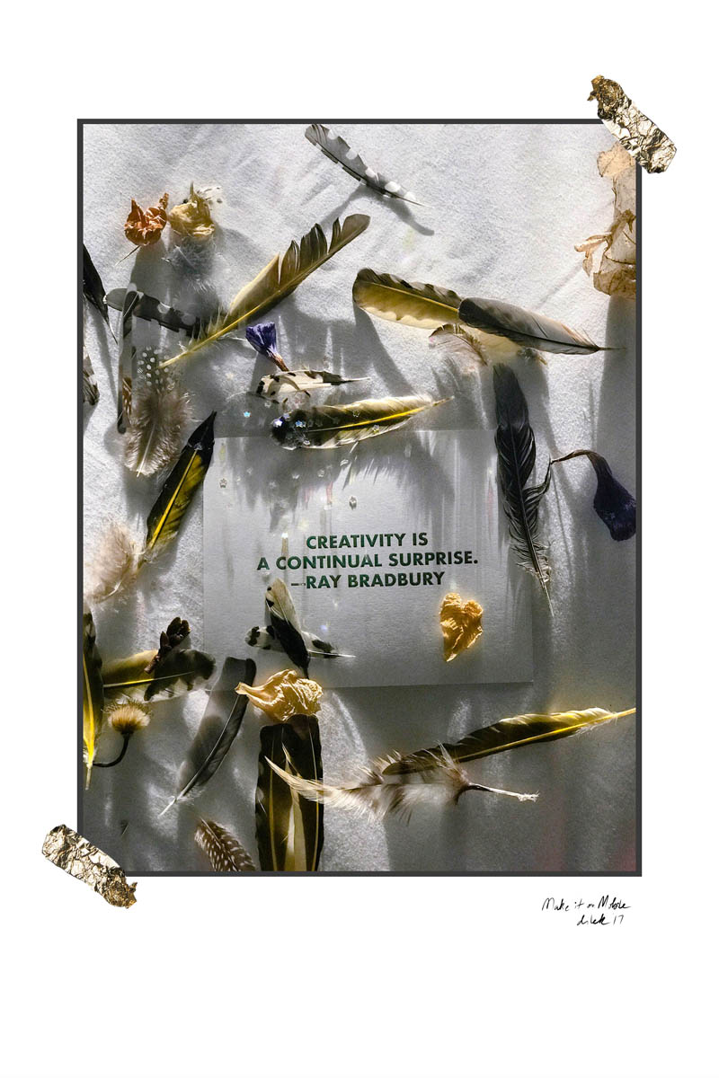
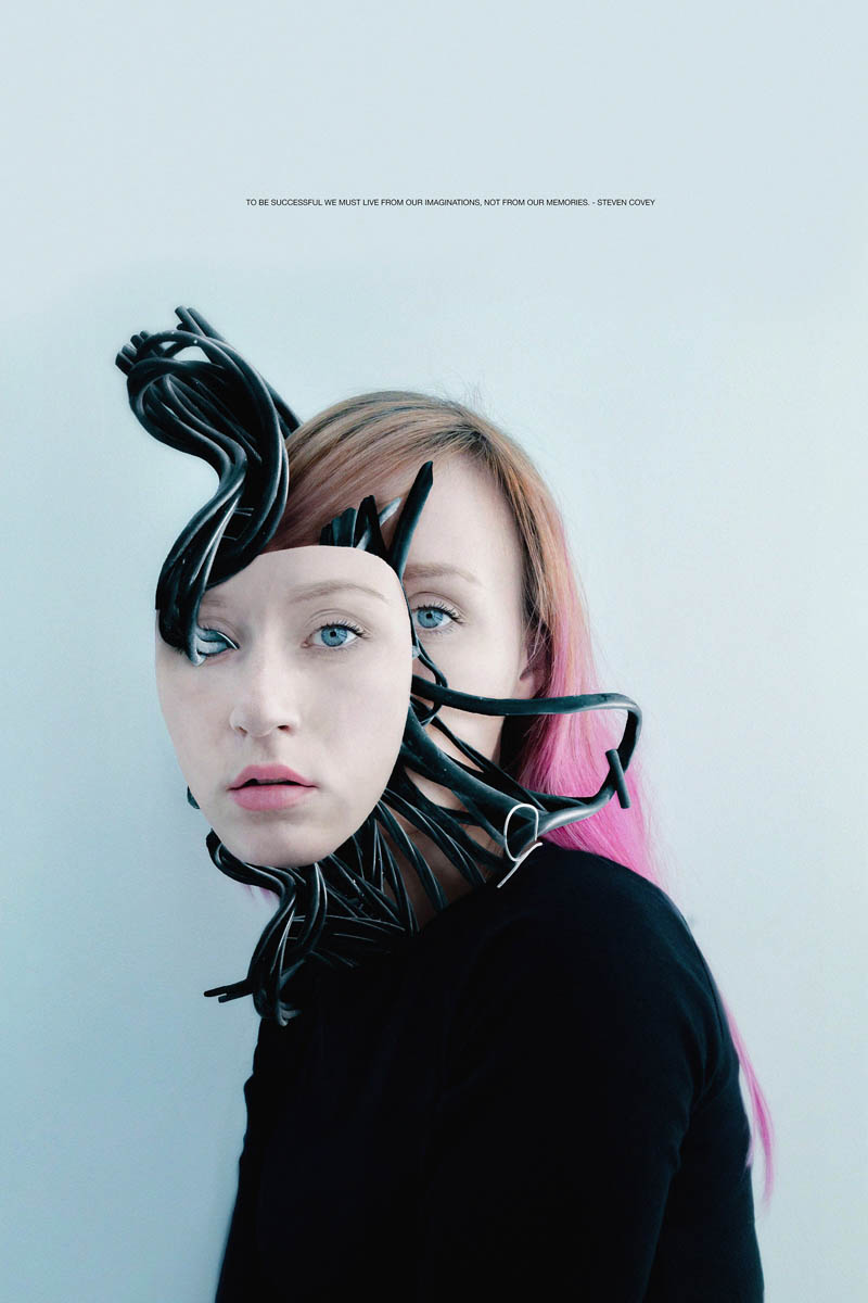
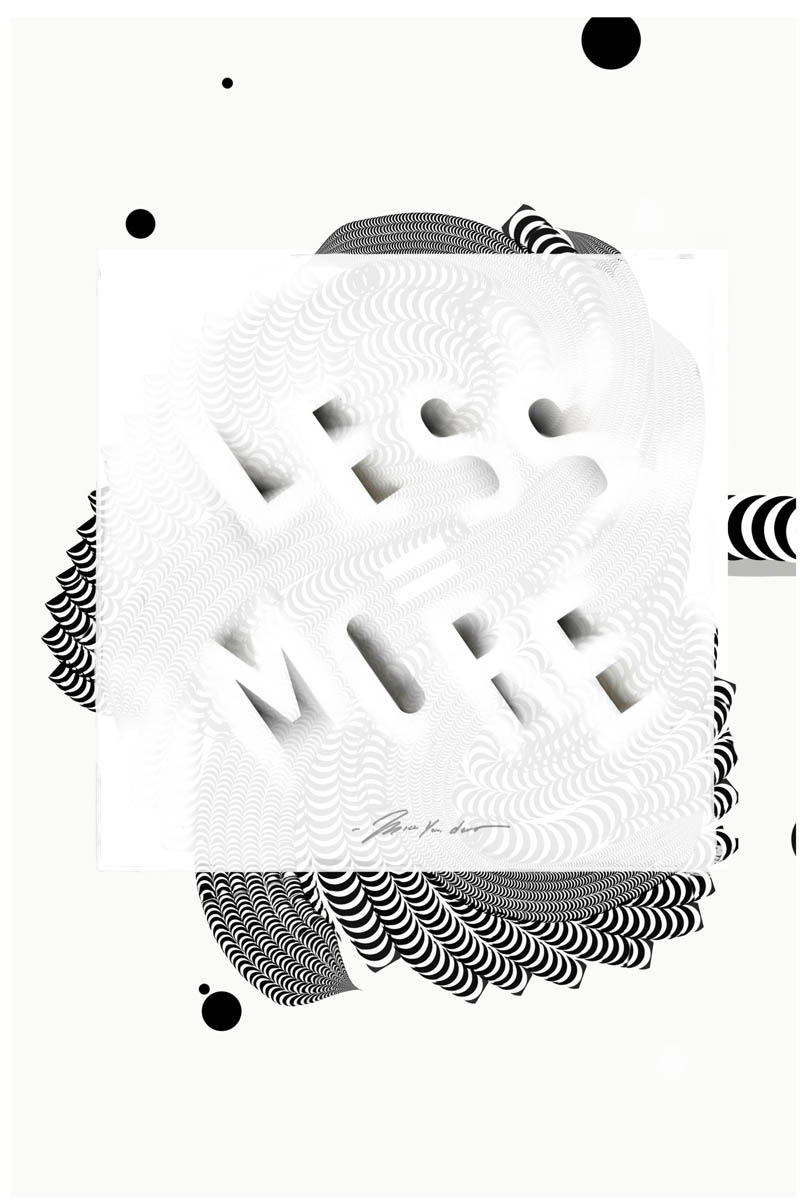
The challenge: Design a poster using only the Adobe iPad apps.
My quote was: "A drawing is simply a line going for a walk" — Paul Klee
Before we jumped in on the projects, we heard talks from some incredible speakers like Ellen Lupton. She drove home the point that visual design can (and should) be a multi-sensory experience. For example, when you see the word "cinnamon" written or drawn out, it activates the olfactory part of your brain and makes you actually smell and taste cinnamon. She posed this question:
How can we create visual work that goes beyond visual?
Pick a card, any card.
Brian inspired us to experiment with the new tools and push the limitations of what a new app can do.
Brian Yap from Adobe shared his journey with mobile drawing, and showed us that even though our tools will always have limitations, there's usually a way to hack it and get the effect that you want. For example, before the vector app, Adobe Draw was able to make tapered brush strokes, he would manually erase each one to give it the look he wanted. I think he has more patience than most of us.
Left: Muna (@munadraws) Right: Brian Yap (@byap)
After the talks, we spent a couple hours walking around downtown Manhattan to gather inspiration and imagery. In addition to some cameras provided by Sony, we used the Adobe Capture app to create textures, color palettes and shapes. I didn't really end up working it into in my poster but it was still cool. I plan to use this app while traveling and type-hunting because it has a really nice interface for auto-tracing in vector.
Left: Tyler Sharp (@tylersharpphoto) shooting Luke Choice (@velvetsprectrum) Right: walking through Tribeca
My favorite tool we learned about – Adobe Capture app for iPhone/iPad.
The one I was most curious about was Adobe Sketch. Because I'm a big fan and user of the (non-Adobe) drawing app, Procreate, I was curious what features were in the works for Sketch. Prior to this event, I did most of my digital work with the Apple pencil in Procreate.
In my opinion, Adobe Sketch is very powerful, but it still has a long way to go in terms of features and convenience. I suspect I will be drawing with both Sketch and Procreate for a while. However, I was happy to learn that all of my favorite photoshop brushes can be used in Sketch, and you can now export time-lapses - finally! Each action or pencil stroke becomes a frame of the video, like this.
When we asked about the future, the Adobe team assured us that we probably won't be worrying about vector vs. raster, pixel sizes or any of that techy stuff. At some point, we will just simply create and the rest will be taken care of by the technology.
We also learned from Bryan Bryan O'Neil Hughes about some other photo editing tools like Lightroom, Photoshop Fix and Mix. These have some incredible capabilities. Call me impatient, but I sort of wish it was all in one app so you don't have to keep switching back and forth for different edits. Maybe it would be too overwhelming, who knows.
One of the coolest features was that everything you made in any of the Adobe apps could be synced to Creative Cloud and it would pop up right in any of the other apps on desktop OR mobile.
I should mention that you do need to have a Creative Cloud subscription to use any of these apps, but if you're a designer / digital artist, you probably already have it, or were thinking about getting it. (Right? I don't know, maybe not.)
We spent the rest of the time working and collaborating with our partners. Many of the artists hadn't ever used the iPad nor the Apple Pencil in their work. It was cool to see everyone learn the tools so quickly and make some awesome work.
Left: Chi Birmingham (@chibirmingham) Right: Flora Borsi (@floraborsiofficial)
I ended up starting off with pen and paper and eventually moving onto the ipad. That's fine if you want to call me a cheater.
Getting feedback from my partner David Prutting (@bfa)
There was a lot of pressure to finish our posters in the end, since we had to print them before the exhibition that night. I don't know about you, but for my process a only few hours to focus on a poster design is not ideal. Somehow we managed to all get them through the large format printer by 6pm.
In the 11th hour, I ended up swapping iPads with my new friend, Jing Wei and we helped each other finish our posters. She needed some help with her lettering, and I wanted a little character for my poster, so it was a perfect fit.
Photos by Bryan O'Neil Hughes
Biggest Takeaways:
- Visual design can go beyond just visual, and it should.
- The iPad is more powerful than I thought, and the software is getting better every day.
- Adobe and Apple are great examples of how a passionate team of people can change an entire industry (and the world).
- You can always push the tools and always find hacks to make them do what you want.
- I don't think digital is the end-all-be-all for sketching or lettering. I'm going to keep creating with a lot of different mediums and tools. The iPad is just one of them I will be using a lot.
- In the future we won't need to worry about vector/raster settings. We will just simply create.
- Collaboration, learning and continuous experimentation above all, will make your work so much better, more fun and interesting.
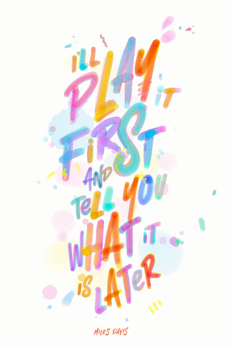
I hope this post inspires you to try out some new tools and ways of working.
What will you do that's new? How can you use new tools to improve your work?
Send me an email at eric@efdotstudio.com. I'd love to hear from you. Subscribe below for more articles like this.
