Lettering for "Alishan" Music Video by Island X
Introduction
After filming and editing a music video from their trip to Taiwan, Matt and Jess approached me to create the lettering for the opening sequence of the video.
The song “Alishan” is an old Taiwanese folk song about the beautiful region of Taiwan (Alishan) and it’s people. The band ISLAND X recorded a modern version of this folk song.
In line with the song’s concept, the video takes the viewer on a journey through Taiwan, exploring both it’s tradition and a newer subculture of break dancing.
A few screenshots from the video to be used as inspiration
Project Goals
- Create beautiful, culturally appropriate lettering for the title sequence of the music video
- Help set the tone of the song/video, (combining the Taiwanese tradition and modernism)
- Overall Enhance the quality of the video to help gain more exposure
I started with the less familiar Chinese lettering, asking Jess to write out the characters in her handwriting. I carefully noting the order and direction of the strokes. I also asked for some visual inspiration to draw from. The visual of the Chinese neon sign kept coming up, since it is an electric version of traditional the calligraphy.
Discovery
Since I am no expert in Chinese Calligraphy, I conducted some research about the different evolution of the written styles and Chinese typefaces. I also walked around China Town, looking at the signs for inspiration, and I compared them with images of signs from Taiwan.
I also listened to older recordings of the folk song and looked up the lyrics to really get a feel for the song.
Sketching
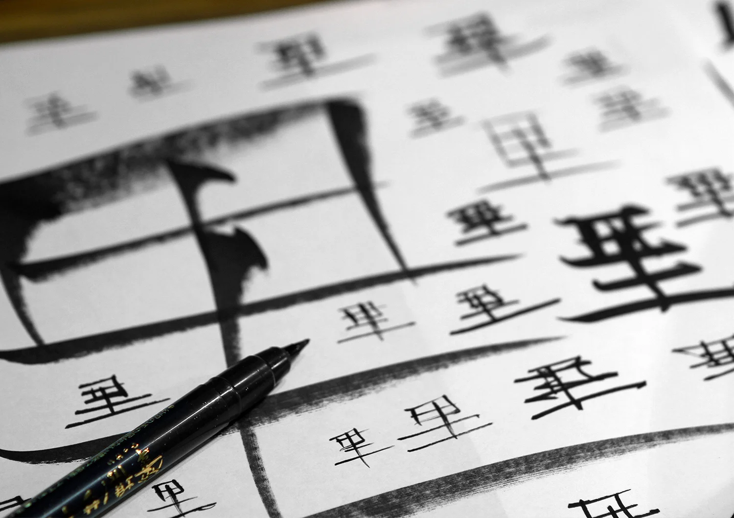
To get acquainted with these unfamiliar letterforms, I practiced drawing them using a variety of different mark-making tools. From pens to markers to paint brushes, I wanted to see how these would come out naturally using my handwriting. I wrote fast, slow, large and small to see what different feelings I could create.
First I drew explorations for each letter and then the entire word
I went back the next day and looked closely at my sketches, picking out the best qualities and details. The next step was to combine these different details into consistent letterforms. I based the legibility on Chinese fonts that I found online.
Narrowed down to 3 lettering directions
As I was drawing the second round of chinese, I began sketching the name of the band as well, using complimentary letter styles. The two needed to have a “family” kind of appearance since they would be viewed together or right after one another.
Refinement
I narrowed it down to three styles of Chinese characters. These three options each had a varying element of tradition to them. I also paired three different styles of ISLAND X with them to match.
Final sketch to vector process
Final Steps
Next I brought them on to the computer and carefully traced each of them in Adobe Illustrator. Experimented with different ways they could be treated over the video. The title would be super imposed onto the moving image of a field, so the lettering needed to pop with a clean aesthetic.
I tried out different versions of a the glow effect to get a feel for which one worked best. I also experimented with different hierarchies and borders, finally landing upon a style that brings in subtle elements of calligraphic motion and forms, while keeping it geometric in structure. The bright neon colors of the two words contrast eachother, creating a visually exciting tension.


