Agile Learning Centers
New York City’s first Agile Learning Center is a K-12 independent school for self-directed learners. ALC provides an adaptive educational model, appropriate for today’s changing world.
Rather than following a forced curriculum, students engage with the world each day through their innate passions and strengths. This allows the kids to create the life they want for themselves, by focusing on their own personal and professional goals.
I was brought on to help distill the school’s mission down to a simple, communicative message, and to design a visual toolkit for the organization to use consistently on all of their different touch points.
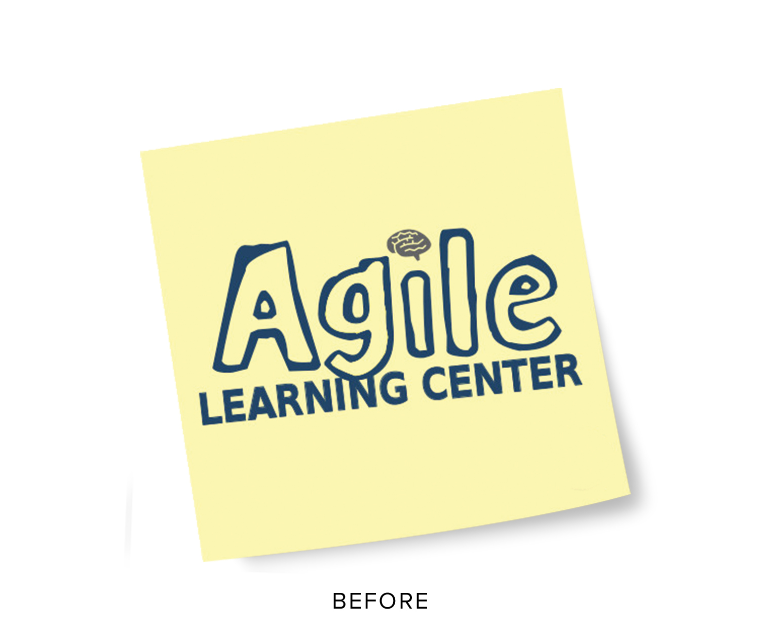
Previous logo, used during the name-change transition
A Brief Story
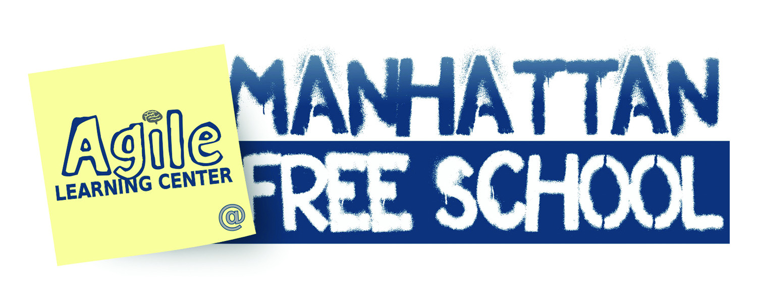
The New York school was first launched in 2008 under the name the Manhattan Free School. The previous owner was planning to close the school in 2012, until one of the employees named Tomis stepped up and took over as director. Meanwhile, Tomis had been working with a friend on a new model: an updated, more "agile" version of the free school, specifically designed for the 21st Century. To ease the transition, the name was changed to "Agile Learning Center @ Manhattan Free School". Over time, the new practices at the school were implemented, involving the parents and students in every decision.
The Challenge
Naturally, there was some confusion amongst the community and prospective families, almost an identity crisis. The school was using this "sticky note" logo during the transition. Tomis explained to me his feelings:
"The visual identity felt dated and unprofessional, and many people didn't understand that the school was truly being reinvented."
On top of that, the old logo didn't appeal to the school's target audience (parents working in forward thinking companies) so it was difficult for people to take it seriously.
Agile Learning Centers needed a fresh, cohesive brand identity.
Project Goals
Approachable
ALC's target demographics are families/parents who are self-employed, entrepreneurs, freelancers, inventors, creators – basically people who haven’t settled for the status quo. Naturally, the audience includes people who are using Agile practices in their work and lives, but also want to paint a friendly picture on the somewhat confusing terminology of "agile". We also wanted to attract thought leaders and businesspeople who don’t necessarily have kids, but are interested in education reform/reinvention.
Scalable
After a few conversations with the client, it became evident that this identity was not just for the New York school. Tomis pictured ALC's evolving into a network of schools, all collaborating together on projects through various means of communication.
Flexible
The new identity also needed to be able to work with other organizations' branding, since they would share Agile Learning practices at varying scales (after school programs, summer camps, workshops, etc.). For this reason, the logo needed to be extremely versatile.
It had to feel current without looking corporate or commercial, and have a friendly and playful appeal without looking crude or juvenile.
Group Kan-Ban Board
Research
I spent several days at the school, speaking with the students & facilitators to get a feel for a typical day (it turns out there's no such thing) and to participate in the rituals and activities. After all, the school is self-directed by the students, so I figured they should play a key role in what this identity would become.
I even took the practices into my own hands and started using agile project management tools like the kan-ban board. This helped me stay organized and on track for each step, and I still use one today.
I read up on the origins of the democratic education movement to learn how Agile Learning Centers was transforming the previous Free School model (it's been around for longer than you think). This research led to the discovery that ALC's main unique factor was that it is always evolving. Anyone can push and pull on the ideas to make their own version on it.
Icon / symbol exercise
Sketching
With all of that in mind, I started the design process with an icon exploration. Using the information in the brief, I identified relevant symbols to work from as a base for developing new logo concepts.
Broad logo exploration sketches using type and image
2nd round sketches
Refinement
Vector exploration
I selected the most successful concepts, and tried out different proportions, line weights and other variations. I focused on the most successful typographic concepts that were more straightforward in nature, but still communicated the desired qualities. I tried different line weights, proportions and scales to find the best possible solution.
Layout of logotype, using the golden ratio.
It was impossible to sum up the future of democratic education in one symbol. So I created a visual language that can expand and adapt to the needs of the organization.
With this tool, the organization could adapt it's identity as the organization evolved. This system came with a short guide for how to create your own icon, so everyone who wanted could participate and make their own version of the logo.
Application
The identity is still currently being rolled out onto new collateral, signage, and a new website,
Results
- Since ALC implemented their new branding, interest and enrollment has increased by 60% at the New York school.
- gile Learning Centers has expanded into a small network of schools and communities in the United States, Puerto Rico and Australia.
- The families, students and staff have reported a greater sense of confidence overall as an organization.
- I was invited to design and document the Agile Summer retreat.
“Eric brings a level of passion and precision to his work that is refreshing and inspiring. I was immediately able to trust Eric in the design process because of his ability to understand the big picture and fine details of the project. He is extremely easy to work with — responsive, articulate, and truly skilled at blending all moving parts into a cohesive brand.”


